
In the 1970s, professor Robert May became interested in the relationship between complexity and stability in animal populations. He noted that even simple equations used to model populations over time can lead to chaotic outcomes. The most famous of these equations is as follows:
xn+1 = rxn(1 – xn)
xn is a number between 0 and 1 that refers to the ratio of the existing population to the maximum possible population. Additionally, r refers to a value between 0 and 4 which indicates the growth rate over time. xn is multiplied by the r value to simulate growth where (1 – xn) represents death in the population.
Lets assume a population of animals is at 50% of the maximum population for a given area. We would allow xn to be .5. Lets also assume a growth rate of 75% allowing r to be .75. After the value xn+1 is computed, we use that new value as the xn in the next iteration and continue to use an r value of .75. We can visualize how xn+1 changes over time.

Within 20 iterations, the population dies off. Lets rerun the simulation with an r value greater than 1.
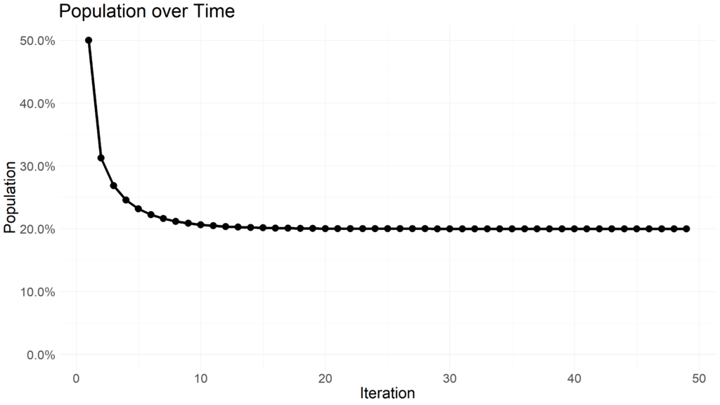
Notice how the population stabilizes at 20% of the area capacity. When the r value is higher than 3, the population with begin oscillating between multiple values.
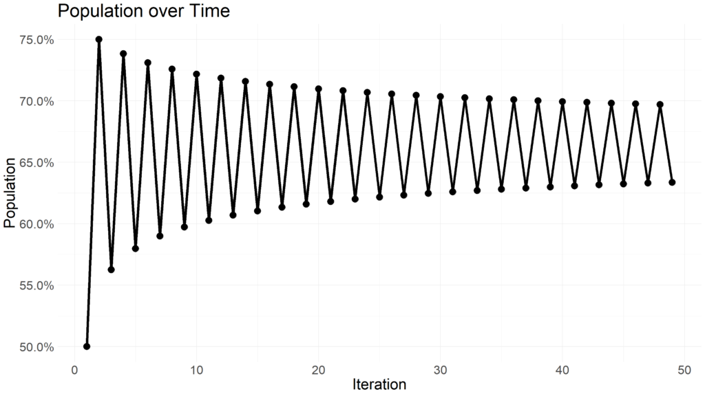
Expanding beyond an r value of 3.54409 yields rapid changes in oscillation and reveals chaotic behavior.

Extremely minor changes in the r value yield vastly different distributions of population oscillations. Rather than experiment with different r values, we can visualize the distribution of xn+1 values for a range of r values using the R programming language.
Lets start by building a function in R that returns the first 1000 iterations of xn+1 for a given r value.
logistic_sim <- function(lamda, starting_x = 0.5) {
  # Simulate logistic function

  vals <- c(starting_x)
  iter <- seq(1, 1000, 1)

  for (i in iter) {
    vals[(i + 1)] <- vals[i] * lamda * (1 - vals[i])
  }

  vals <- vals[-length(vals)]
  tibble::tibble(vals, lamda, iter)
}
This function returns a dataframe with three columns: the iteration number, the r used for each iteration, and the xn+1 value computed for that iteration.
Now we need to iterate this function over a range of r values. Using purrr::map_dfr we can row bind each iteration of r together into a final dataframe.
build_data <- function(min, max) {
  # Build data for logistic map

  step <- (max - min) / 400

  purrr::map(
    seq(min, max, step),
    logistic_sim
  ) |>
    purrr::list_rbind()
}
Min refers to the lower limit of r while the max refers to the upper limit. The function will return a dataframe of approximately 400,000 values referring to each of the 1000 iterations for the 400 r values between the lower and upper bound. The function returns all 400,000 values in less than a quarter of a second.
With the dataframe of values assembled, we can visualize the distribution of values using ggplot.
build_data(1, 4) |>
  dplyr::filter(iter > 50) |>
  dplyr::slice_sample(prop = 0.1) |>
  ggplot2::ggplot(aes(
    x = lamda,
    y = vals,
    color = lamda
  )) +
  ggplot2::geom_point(size = 0.5) +
  ggplot2::labs(
    x = "Growth Rate",
    y = "Population Capacity",
    title = "Testing Logistic Growth in Chaos"
  ) +
  ggplot2::scale_x_continuous(
    labels = scales::percent
  ) +
  ggplot2::scale_y_continuous(
    labels = scales::percent
  ) +
  ggplot2::theme_minimal() +
  ggplot2::theme(
    legend.position = "none",
    text = element_text(size = 25)
  )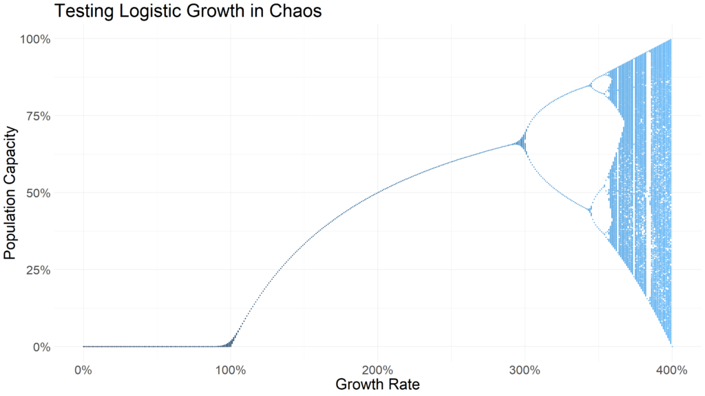
Notice how r values of less than 1 indicate the population dies out. Between 1 and just under three, the population remains relatively stable. At around 3, the populations being oscillating between two points. Beyond an r of 3.54409, chaos ensues. It becomes extremely difficult to predict the value of xn+1 for a given iteration with an r value above 3.54409. So difficult, in fact, that this simple deterministic equation was used as an early random number generator.
So what are the practical applications for this? Representations of chaos (or systems that yield unpredictable results and are sensitive to starting conditions) can be seen across many industries and fields of study. In finance, for example, intra-day security prices have been described as a random walk – extremely difficult to predict. While long term outlooks may show seasonality, chaos theory can help model the extremely chaotic and unpredictable nature of stock prices.