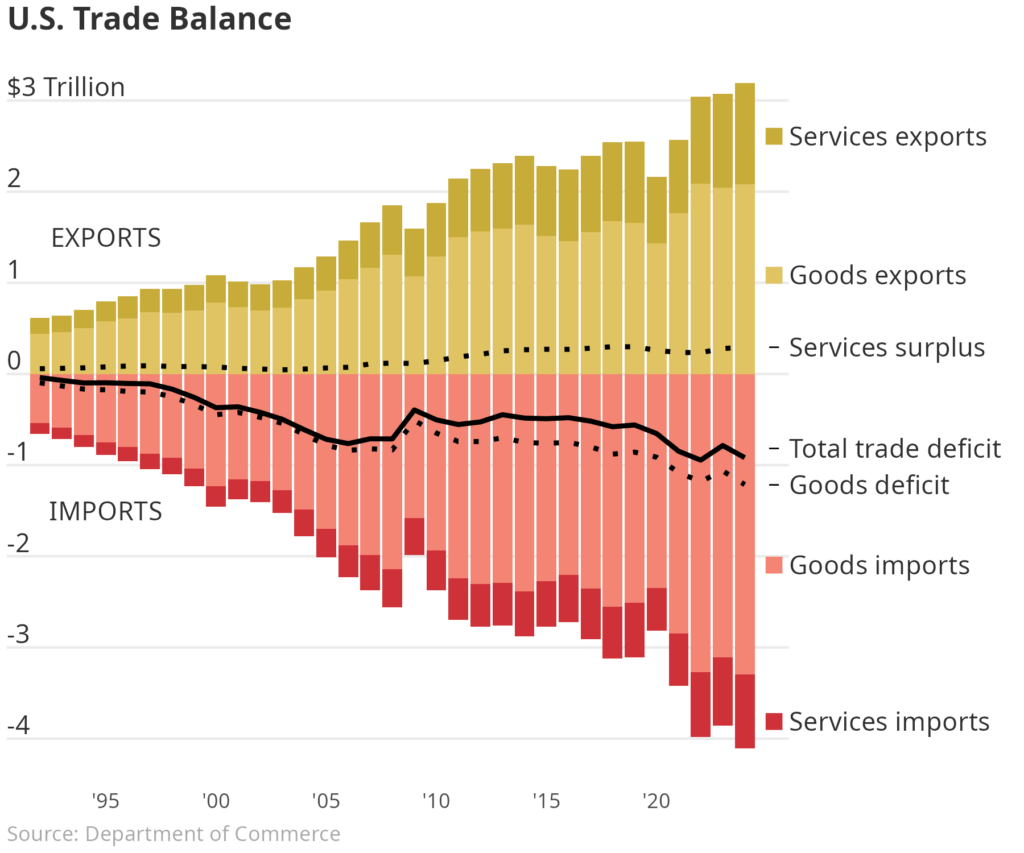
Many major publishing outlets have recently created their own visuals to explain U.S. trade. One particular visualization in the Wall Street Journal caught my eye. It showed the relative trade imbalance for goods and services by year in the United States. One good exercise for Data Scientists is to pick apart and recreate a chart from well known publishers. You can see the chart below and the code below that. Enjoy!
#### Setup ####

library(tidyverse)

data <-
  readr::read_csv(
    file = "~/Documents/trade.csv",
    show_col_types = FALSE
  ) |>
  dplyr::group_by(
    year = lubridate::floor_date(observation_date, "year")
  ) |>
  dplyr::filter(
    year <= "2024-01-01"
  ) |>
  dplyr::reframe(
    Services_import = 0 - sum(BOPSIMP),
    Services_export = sum(BOPSEXP),
    goods_import = 0 - sum(BOPGIMP),
    goods_export = sum(BOPGEXP),
    Services_surplus = Services_export + Services_import,
    goods_deficit = goods_export + goods_import,
    total_deficit = Services_surplus + goods_deficit
  ) |>
  dplyr::reframe(
    year,
    "Services surplus" = Services_surplus / 1e6,
    "Goods deficit" = goods_deficit / 1e6,
    "Total trade deficit" = total_deficit / 1e6,
    "Services imports" = Services_import / 1e6,
    "Services exports" = Services_export / 1e6,
    "Goods imports" = goods_import / 1e6,
    "Goods exports" = goods_export  / 1e6
  ) |>
  tidyr::pivot_longer(
    cols = - year
  )

#### Plot ####

bars <- c(
  "Services exports",
  "Goods exports",
  "Services imports",
  "Goods imports"
)

final <-
  dplyr::slice_max(
    data,
    year
  ) |>
  dplyr::mutate(
    value = value + dplyr::case_match(
      name,
      "Goods exports" ~ -1,
      "Goods imports" ~ 1.2,
      "Services exports" ~ 1.5,
      "Services imports" ~ -3,
      "Total trade deficit" ~ 0.1,
      .default = 0
    )
  )

data |>
  dplyr::filter(
    name %in% bars
  ) |>
  dplyr::mutate(
    name = factor(name, bars)
  ) |>
  ggplot2::ggplot(
    ggplot2::aes(
      x = year,
      y = value
    )
  ) +
  ggplot2::geom_col(
    ggplot2::aes(fill = name)
  ) +
  ggplot2::geom_line(
    data = dplyr::filter(data, !name %in% bars),
    linewidth = 1,
    ggplot2::aes(
      group = name,
      linetype = name
    )
  ) +
  ggplot2::geom_text(
    inherit.aes = FALSE,
    hjust = 0,
    color = "#313131",
    ggplot2::aes(
      x = x,
      y = y,
      label = label
    ),
    tibble::tibble(
      x = as.Date(min(data$year)) - months(18),
      y_base = as.character(seq(-4, 3, 1)),
      label = dplyr::if_else(y_base == "3", "$3 Trillion", y_base),
      y = as.numeric(y_base) + 0.15
    )
  ) +
  ggplot2::geom_text(
    data = final,
    hjust = 0,
    color = "#313131",
    inherit.aes = FALSE,
    ggplot2::aes(
      x = as.Date("2026-01-01"),
      y = value,
      label = name
    )
  ) +
  ggplot2::geom_point(
    data = final,
    inherit.aes = FALSE,
    size = 3,
    ggplot2::aes(
      x = year + months(16),
      y = value,
      color = name,
      shape = name
    )
  ) +
  ggplot2::geom_text(
    inherit.aes = FALSE,
    color = "#313131",
    data = tibble::tibble(
      x = as.Date("1995-01-01"),
      y = c(-1.5, 1.5),
      label = c("IMPORTS", "EXPORTS")
    ),
    ggplot2::aes(
      x = x,
      y = y,
      label = label
    )
  ) +
  ggplot2::theme_minimal() +
  ggplot2::theme(
    text = ggplot2::element_text(color = "#313131"),
    axis.text.y = ggplot2::element_blank(),
    panel.grid.minor = ggplot2::element_blank(),
    panel.grid.major.x = ggplot2::element_blank(),
    plot.title = ggtext::element_markdown(),
    legend.position = "none",
    plot.margin = ggplot2::margin(0.1, 3.5, 0.1, 0.1, "cm"),
    plot.caption = ggplot2::element_text(
      color = "darkgray",
      hjust = 0
    )
  ) +
  ggplot2::scale_x_date(
    breaks = as.Date(glue::glue("{x}-01-01", x = seq(1995, 2020, 5))),
    date_labels = "'%y",
    expand = c(0, 0)
  ) +
  ggplot2::scale_y_continuous(
    breaks = seq(-4, 3, 1),
    labels = rep("", 8)
  ) +
  ggplot2::labs(
    title = "**U.S. Trade Balance**",
    caption = "Source: Department of Commerce",
    x = NULL,
    y = NULL
  ) +
  ggplot2::scale_linetype_manual(
    values = c(
      "Goods deficit" = "dotted",
      "Services surplus" = "dotted",
      "Total trade deficit" = "solid"
    )
  ) +
  ggplot2::scale_fill_manual(
    values = c(
      "Services exports" = "#c7ac39",
      "Goods exports" = "#e0c463",
      "Goods imports" = "#f48574",
      "Services imports" = "#ce3138"
    )
  ) +
  ggplot2::scale_color_manual(
    values = c(
      "Services exports" = "#c7ac39",
      "Goods exports" = "#e0c463",
      "Goods imports" = "#f48574",
      "Services imports" = "#ce3138",
      "Services surplus" = "black",
      "Total trade deficit" = "black",
      "Goods deficit" = "black"
    )
  ) +
  ggplot2::scale_shape_manual(
    values = c(
      "Services exports" = 15,
      "Goods exports" = 15,
      "Goods imports" = 15,
      "Services imports" = 15,
      "Services surplus" = 95,
      "Total trade deficit" = 95,
      "Goods deficit" = 95
    )
  ) +
  ggplot2::coord_cartesian(
    clip = "off"
  )

ggplot2::ggsave(
  filename = "wsj-plot.png",
  bg = "white",
  width = 6,
  height = 5
)